10 essential designer tips for combining fonts
Posted by staff / March 6, 2015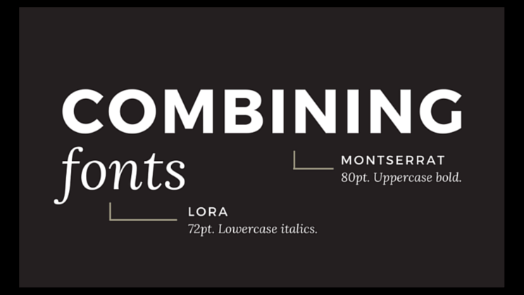
The right combination of fonts in an image can make a DIY design look slick and professional, while the wrong combination puts the focus on all the wrong things.
If you want a professional look without a professional price tag, check out these tips from Janie Kliever at Canva to take your designs to the next level.
01. Choose complementary fonts.
Many fonts have distinct moods or personalities — serious, casual, playful, elegant. You want to make sure the moods of your font choices match the purpose of your design. For instance, a rounded, bubbly typeface may be appropriate for a child’s birthday party invitation, but not for your business newsletter.
As is often the case with people, opposites tend to attract: “introverted” and “extroverted” fonts balance each other nicely when combined. So if you have a distinctive font with a “strong personality” (often referred to as a display font), pair it with something more neutral and conservative for a balanced design…
02. Establish a visual hierarchy.
Traditional publishing formats like newspapers and magazines offer good examples of how to apply a visual hierarchy to fonts. They combine fonts in way that visually separates different textual elements like headlines, sub-headlines, body copy, and captions. Qualities such as size, boldness (also known as “weight”), and spacing (including leading, the space between lines, and kerning, the space between letters) all contribute to how the eye should navigate the page and what text should attract attention first…
Full story at Canva.
Graphics credit: Canva


Comments are off for this post.