4 clever color combinations to make your designs pop
Posted by staff / September 6, 2014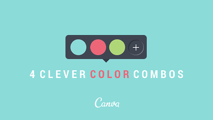
Color is key to evoking certain moods and emotions in your target audience, and if you’ve been looking for some novel ways to spruce up your images, Poppie Pack at Canva has four eye-catching combinations to try.
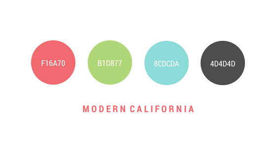
1. Modern California
-
The combination of two warm and two cooler colors will create a calm balance to your design.
-
Crisp apple green is a great color to use if your concept is eluding to freshness or cleanliness.
-
Using a rich, darker color for your base (4D4D4D) is a nice way to form contrast to fellow, lighter layers.
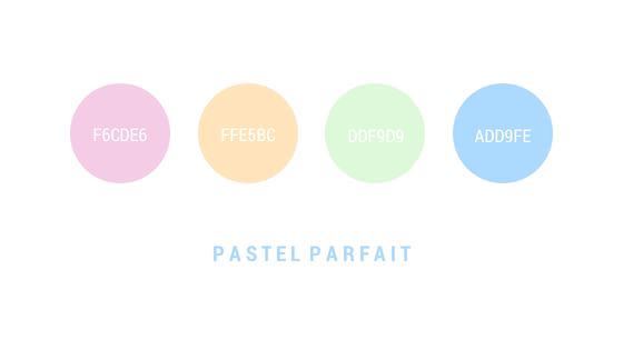
2. Pastel Parfait
-
The pastel color group brings with it the visual illusion of femininity, and can often appear a little washed out – apply a stronger tone if you find your message getting lost in the dust.
-
These powdery tones evoke feelings of ‘happiness’ and ‘lightness’, perfect to use when eluding to the warmer and sunnier seasons.
-
Although considered a little retro, pastels are actually very on-trend and work well in a layered effect.
Full story at Canva.
Graphics credit: Canva


The link above only goes to Canva’s welcome page. The story being quoted is here.. http://blog.canva.com/4-clever-color-combinations/
Delicious stuff. Cheers.
Thanks!