Healthcare in the U.S.: Statistics & trends [infographic]
Posted by staff / January 8, 2014 Affordable Care Acthealthcare marketimplementationinfographic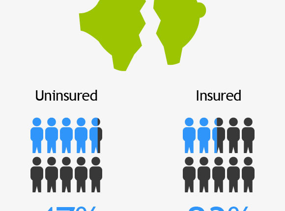

While the implementation of the Affordable Care Act continues, it’s always good to keep a sense of perspective about what the U.S. healthcare market looks like now to be able to make judgments on what effect the legislation is having on both the uninsured and the price of healthcare.
This infographic from CauseWish does just that with a broad overview of our current system.
Via CauseWish.


An Interesting cost-side comparison. It would have been more impactful if there was also a comparison of health outcomes (i.e., what does our extra spending buy by way of health/quality of life?).
[…] While the implementation of the Affordable Care Act continues, it's always good to keep a sense of perspective about what the U.S. healthcare market looks like now to be able to make judgments on w… […]