The cost of living in the U.S. [infographic]
Posted by staff / February 28, 2014 gas pricesinfographic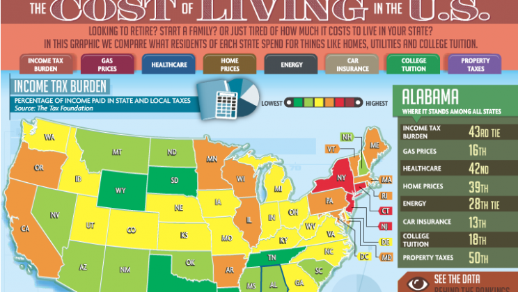
Looking to move in the near future and wondering where you can get the most for your money?
Check out this infographic that takes a look at the rankings of each state in terms of a whole host of factors including college tuition, gas prices, and home prices to name a few, and make your next move all the more wisely.
H/T to Aldo Baker.


This is useless information. It would be better to compare similar towns vs bundling all into a state by state view. Cost of living in Malibu not the same as Bakersfield.
Alaska is the 51st? This thing counting Puerto Rico, when we pick up another state?
I see it district of Columbia they are counting
This is a chart of costs represented as a chart of value. And there is no thought about how costs trade off (for instance, New Hampshire is low in income tax [because they have very little] but high in other taxes and very high in tuition). The money has to come from somewhere. Home prices high, property taxes low? Again, a tradeoff you don’t register. It means a lower tax rate on higher-priced homes, yielding more tax revenues.
In some of these “low-cost” states, there is less value being created, such as in states with low rankings across the board (the “green” states). In these states, there’s usually not much value being created for residents, or there is a huge industry (mostly oil and gas) that is reducing tax burdens. The states that are orange and red actually have the better educational systems, better infrastructure, lower tuition, and better quality of life.
People in the green states share in less collectively, so there is a hidden burden of having to pay for a lot of things yourself. Or just not having great schools, good roads, clean water, clean air, and well-regulated industry.
Who came up with this?
[…] the price of dwelling within the U.S. [infographic] – Holy Kaw! […]
[…] the cost of dwelling in the U.S. [infographic] – Holy Kaw! […]
[…] the price of living within the U.S. [infographic] – Holy Kaw! […]